Sunday, December 27, 2015

ICP - Teen Academy - Black and White I - Fall 2015


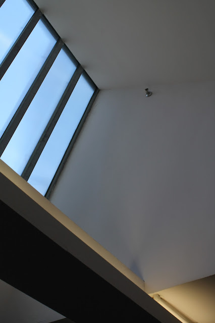
Artist Statement - Geometry class, like most is probably not my favorite class, but for some reason I’m attracted to shape and pattern and consistency evident in architecture and the natural world around us.
For my final presentation I focused on these factors; shapes and patterns and their interaction with light. Initially my work focused on right angles and “sharp” architecture including triangles and squares. After our artist visit with documentary photographer, Gareth Smit I decided to embrace softer lighting and softer more circular shapes. This distinction is probably most evident between the first image of the cube and the image of the lamp. The distinction between sharp and slightly out of focus are evident. I wanted to experiment with something that I wasn’t necessarily drawn to since I usually gravitate to “sharper” architecture.
This was my second Black and White class with ICP. I loved this experience because I got to focus more on my artistry instead of focusing on just the basics. I also learned more about myself as a photographer including my style and my artistic preferences. I hope to continue my exploration of shapes and pattern as well as expanding and exploring other subjects

(Will probably update this later with more personal reflection and where the picture were taken etc.)

ICP Teen Academy - Black and White I - Summer 2015

Quick Disclaimer: The specks of dust you see (most clearly visible on the black parts of the print) are most likely from the scanner. 


This was my first experience working with film and looking back at it now that's pretty clear. Since this was my first film class I didn't really know what I wanted to photograph so my subjects were very sporadic and random. I'm definitely more aware of a connecting theme now.  
Composition: I don't think it's too terrible but everything was so new to me that I was just snapping frames, using up 5 rolls of film in one trip without any real thought behind composition. I especially notice this with the image of the woman tanning. If I had placed her perhaps in the upper left corner her limbs would be pointing diagonally across the page and your eye would follow that more than just seeing a body plopped in the middle of the frame.  

Borders: You can't really see the borders obviously since it's white borders on a white screen. I usually print 6x9 leaving a pretty significant border. I've never really strayed from that but I want to start experimenting with slimmer borders. 

Exposure + Lighting: The majority of the images here were either taken on Coney Island during a class trip or The Cloisters.  So either my image is incredibly gray because of the intense sun making it hard to have contrast or pretty dark because of stone rooms and such. 

I'm probably being a little hard on myself but I'm proud that I can look back at my work and see where I could have improved since I think I've grown a lot by taking another Black and White I class. 

Wednesday, November 18, 2015

Rome


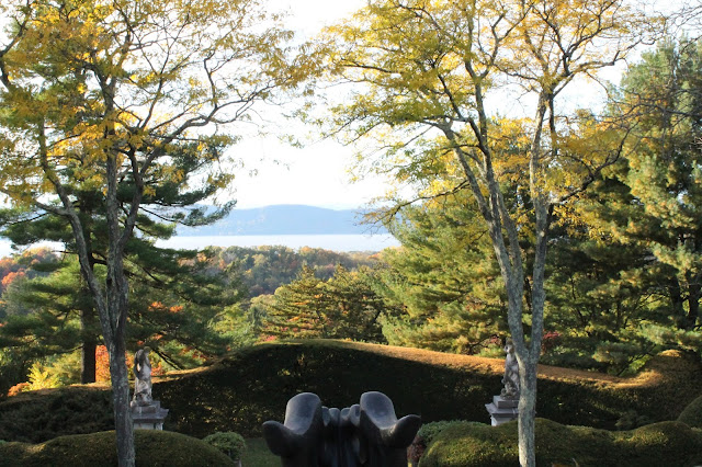
Sleepy Hollow


Kykuit - The Rockefeller Estate


Open House New York - 2015


"For two days each October, the Annual Open House New York Weekend unlocks the doors of New York’s most important buildings, offering an extraordinary opportunity to experience the city and meet the people who design, build, and preserve New York.  
From historical to contemporary, residential to industrial, hundreds of sites across the five boroughs are open to visit, with tours, talks, performances, and other special events taking place over the course of OHNY Weekend. Through the unparalleled access that it enables, OHNY Weekend deepens our understanding of the importance of architecture and urban design to foster a more vibrant civic life, and helps catalyze a citywide conversation about how to build a better New York. "